Refine Studio
A freelance cosmetic enhancement practice based in Benalla and Melbourne.
creative direction ~ branding ~ social design
Mikayla’s specialty within the highly saturated field of cosmetics, is maintaining a natural aesthetic by enhancing the individual’s unique features. She offers her services to everyone, although her main clientele base is comprised of women, and ensures all of her clients are guided through a thorough consultation before every session, especially enhancements, to discuss the best way to achieve the client’s desired outcome in a safe, and natural-looking way. She currently operates out of a studio room in a bodybuilding gym.
Refine Studio is a freelance, cosmetic injectables practice founded by Mikayla, specialising in natural, minor enhancements, as well as skin treatments.
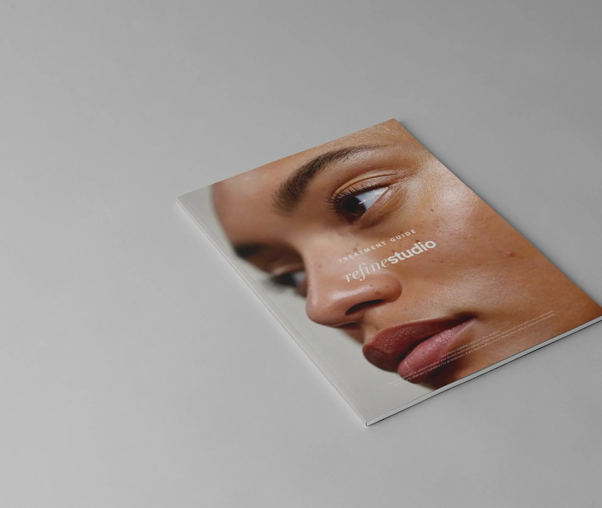
With the current climate of cosmetic injecting being significantly more regulated, Refine Studio required a rebrand that remodelled its social design, with emphasis on its copy and brand tone, as well as something to suit the new studio space. In terms of branding, she also wanted something that she could continue to integrate on her own, seeing as her services were more cost efficient to her clients, and didn’t want something that was too complicated and time-consuming to integrate on her own, therefore creating some templates and simple guidelines would be a perfect way to give her some guided inspiration when creating content and writing copy for socials.
Branding
1.0
Clientele key values:
1. 2. 3. 4. 5. 6. 7. 8.
natural-focussed trusting image-conscious confidence seeking curious loyal value driven middle-class
Refine Studio’s end clients understand the oversaturated market of aestheticians, and are namely aiming to establish a relationship with a budget friendly, yet professional and highly regarded clinician. The main concerns are (not uncommonly) for older clientele is aging, and looking too overdone or unnatural across all age categories, with clientele willing to travel to receive treatment.
The logo is derived from inspiration sources that highlight duality, and integrate softer features in lettering and colour (see inspiration sources). Utilising the new colour scheme, the logo appeals to both women and men by nodding to delicate and powerful attributes - light versus dark colours; curvy and delicate lettering versus bold and sans serif lettering; italicised versus regular and wide - however, overall, paints a more femme persona. The inverted colour suites allow for more flexibility in application: being quite a neutral colour palette, this allows for synergy between the social strategy (content to emphasise natural enhancements) as well as fitting in well with the Port Melbourne studio space. The three logo concepts are to be used as a standalone logo, iconographic purposes (favicon, instagram dp, ect.) and business card/watermark for additional assets.


The colour palette is derived from the select inspiration sources (see beginning of document), as well as previous logo version. The tonality of the new concepts have been slightly adjusted, and a duo tonal scheme has been applied to create two logo suites. The goal with the pallete is to ensure that the swatches are easily integratable, meaning they do not strike as something super identifiable. this makes creating content around them a lot smoother and more cohesive.
The colour scheme is also a reflection of natural tones and elements to allude to the aesthetic results from Refine Studio, such as stone and skin. the slight adjustment from the original logo also alludes to the physical studio space and its colour scheme - the benchtop, wall colour and warm lighting - which implicitly primes clientele to the new space.

social design
2.0

The underpinning nature of the social design is to illustrate professionalism and trust, as well as establish commonality with Refine’s target demographic. In doing so, the three content pillars homed in on were educational, inspirational and relatable, which would help to support these brand values consistently in creating strong associations.
From a visual standpoint, the imagery used is driven by natural elements, which falls into all content pillars - strongly supporting this notion of natural and organic, in conjunction with a cleaner, general aesthetic to evoke a sense of calmness. There is a loose consistency with the brand colour palette, across the grid, which nicely upkeeps and solidifies the visual identity, in addition to consistently incorporating brand marks to reiterate brand presence. In terms of written elements and copy, kept the visual hierarchy simple: emphasised formatting of the same typeface to establish to illustrate key messaging.